Hey there,
This is just a short post about small changes to the Karmen user interface, especially related to mobile phones. We will continuously strive to improve the Karmen user experience by fine-tuning existing features.
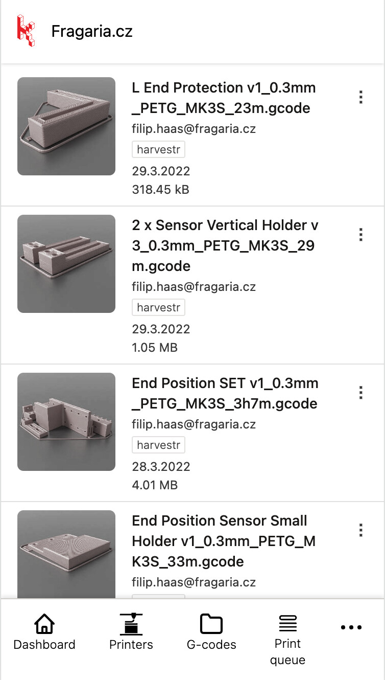
The most significant change you’ll notice at first glance on mobile phones is the new mobile menu at the bottom of the screen, designed to help you navigate the application more easily.
Our statistics show that approximately 40% of users access Karmen from mobile phones. If there’s anything bothering you, please let us know ![]() , and we will do our best to make improvements. Your feedback is genuinely important to us.
, and we will do our best to make improvements. Your feedback is genuinely important to us.
Have a great day! ![]()
Martin Bilek